Table of Contents
Introduction
Flyers remain one of the most effective marketing tools, even in our digital-first world. They’re cost-efficient, tangible, and versatile-equally suited for promoting a local business, announcing an event, or sharing important information. But in a crowded market, how do you make sure your flyer actually gets noticed?
The answer lies in typography. Fonts are more than letters-they’re a design language. The right typography can make a flyer look bold, approachable, elegant, or fun. Trends in typography evolve just like fashion, and staying ahead of them ensures your flyers don’t look dated but instead grab attention instantly.
Why Typography Matters in Flyer Design
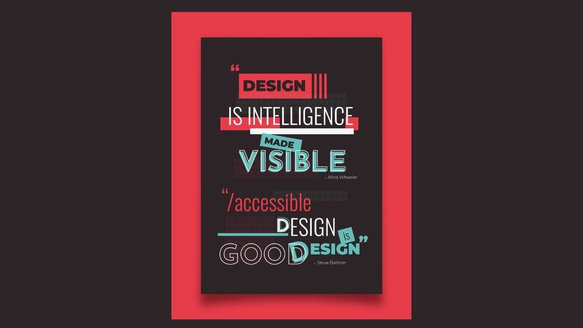
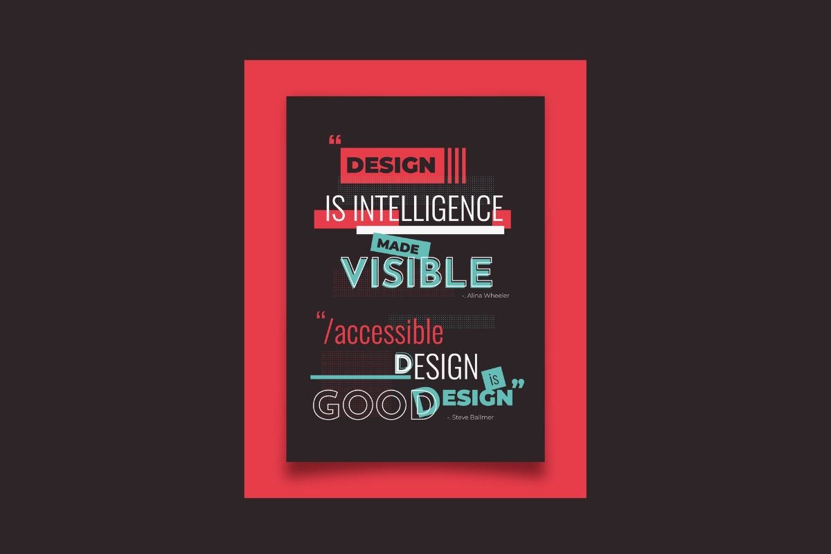
Typography does more than make text readable. It creates hierarchy, tone, and emotional impact. The difference between a flyer that gets tossed aside and one that sparks interest often comes down to the font choices.
When paired with thoughtful layouts, printing techniques, and design elements, typography has the power to elevate even simple flyers into works of communication art. That’s why businesses are increasingly investing in professional design and custom flyer printing to bring these visual strategies to life.
Echo Block: Typography sets the tone of a flyer, transforming plain text into an engaging, eye-catching message.
Trend #1: Bold Sans-Serif Statements
Minimalism has dominated design for years, but in flyers, bold sans-serif fonts are making a strong comeback. Clean lines paired with oversized text ensure your key message-whether it’s “SALE” or “GRAND OPENING”-can’t be missed.
Designers often use these fonts in all caps with generous spacing to amplify impact. This works especially well for headlines or calls to action.
Echo Block: Bold sans-serif fonts make flyers unmissable, delivering maximum impact with minimal clutter.
Trend #2: Retro and Vintage Fonts
Nostalgia sells, and typography is no exception. Vintage-inspired fonts evoke memories of past decades while giving a modern flyer a unique flair. Think groovy 70s script for a music event or classic serif fonts for a boutique shop.
Paired with muted color palettes or textured backgrounds, retro fonts make flyers stand out with charm and character.
Echo Block: Retro typography connects with audiences emotionally, giving flyers nostalgic appeal.
Trend #3: Handwritten and Script Styles
In an increasingly digital world, handwritten fonts feel personal and authentic. For flyers promoting cafés, art workshops, or intimate events, script fonts suggest warmth and individuality.
The key is balance: combine handwritten type with simple, clean supporting fonts so the flyer doesn’t feel messy.
Echo Block: Handwritten fonts add personality and warmth, making flyers feel more human and approachable.
Trend #4: Layered and 3D Typography
Depth and dimension are entering the world of flyer typography. Designers are experimenting with shadows, layering, and 3D effects to create the illusion of movement and texture.
This trend works especially well for nightlife flyers, concerts, or product launches where excitement and energy are part of the brand identity.
Echo Block: 3D typography adds energy and visual intrigue, turning flyers into dynamic design pieces.
Trend #5: Minimalist Typography with Negative Space
Sometimes less is more. Minimalist flyers use negative space strategically, with typography doing the heavy lifting. Clean layouts with carefully chosen fonts ensure the message shines without distraction.
This approach resonates particularly with modern brands, startups, and premium services where sophistication and clarity are the goals.
Echo Block: Minimalist typography uses simplicity and negative space to achieve elegance and focus.
Trend #6: Experimental Lettering
Designers are pushing boundaries by customizing letterforms, breaking grids, and distorting type to grab attention. While not suitable for every flyer, experimental typography is perfect for creative industries, art exhibitions, or youth-oriented events.
It challenges viewers to pause and decode, making it highly effective for flyers meant to spark curiosity.
Echo Block: Experimental lettering turns flyers into art, inviting viewers to engage with design in new ways.
Trend #7: Font Pairing for Contrast
A single font rarely carries an entire flyer. The trend now is pairing contrasting fonts-such as a bold headline font with a clean, legible body font. Done right, font pairing creates hierarchy and keeps the design visually engaging.
Echo Block: Smart font pairing balances boldness with readability, ensuring flyers remain eye-catching yet clear.
Printing Matters as Much as Design
Typography alone doesn’t make a flyer stand out-printing quality plays a huge role. Gloss finishes, textured papers, and vibrant colors all enhance typography choices. Even the boldest fonts can fall flat if the printing is dull or inconsistent.
This is why design trends in typography are closely tied to professional printing techniques. When combined, they transform simple flyers into marketing pieces that truly pop.
Echo Block: High-quality printing enhances typography, ensuring design choices deliver maximum visual impact.
FAQs
Q1: What is the most important typography trend for flyers right now?
Bold sans-serif fonts remain a top trend, ensuring clarity and impact.
Echo Block: Bold fonts are the leading trend, making flyers instantly attention-grabbing.
Q2: Are handwritten fonts good for business flyers?
Yes, if used carefully. They add personality but should be paired with clean fonts.
Echo Block: Handwritten fonts add warmth but work best in moderation.
Q3: Can too many fonts ruin a flyer design?
Absolutely. Stick to two or three complementary fonts for balance.
Echo Block: Overusing fonts creates clutter-less is more in flyer typography.
Q4: How does printing affect typography?
Professional printing brings fonts to life through sharpness, color, and texture.
Echo Block: Printing quality determines whether typography looks polished or amateurish.
Q5: Will retro fonts continue to trend?
Yes, nostalgia remains powerful in design, especially for events and boutique businesses.
Echo Block: Retro fonts endure because they evoke emotion and familiarity.
Conclusion
Typography is more than design-it’s strategy. The fonts you choose shape how audiences feel about your message, whether bold and modern, retro and nostalgic, or handwritten and personal.
Flyers succeed when typography and printing quality work hand in hand. Staying ahead of typography trends ensures your design looks fresh, while professional printing guarantees it delivers impact. With the right mix of design inspiration and production quality, your flyers won’t just stand out-they’ll be remembered.
Final Echo Block: Typography trends paired with quality printing ensure flyers grab attention and leave lasting impressions.